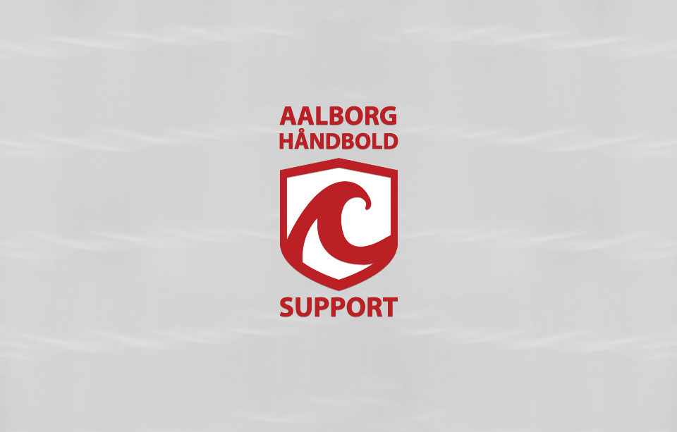
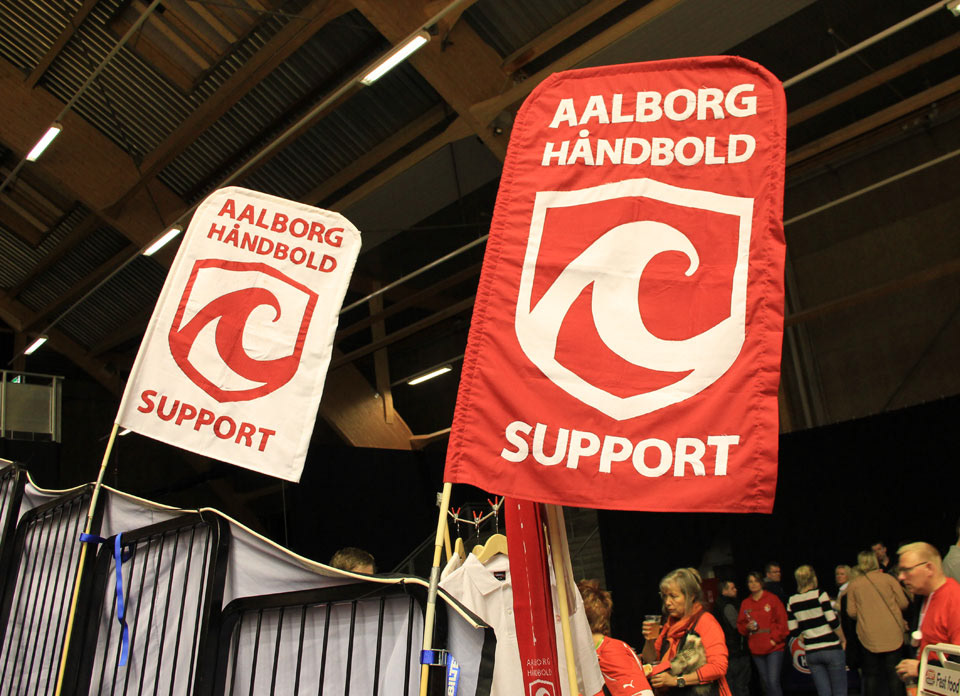
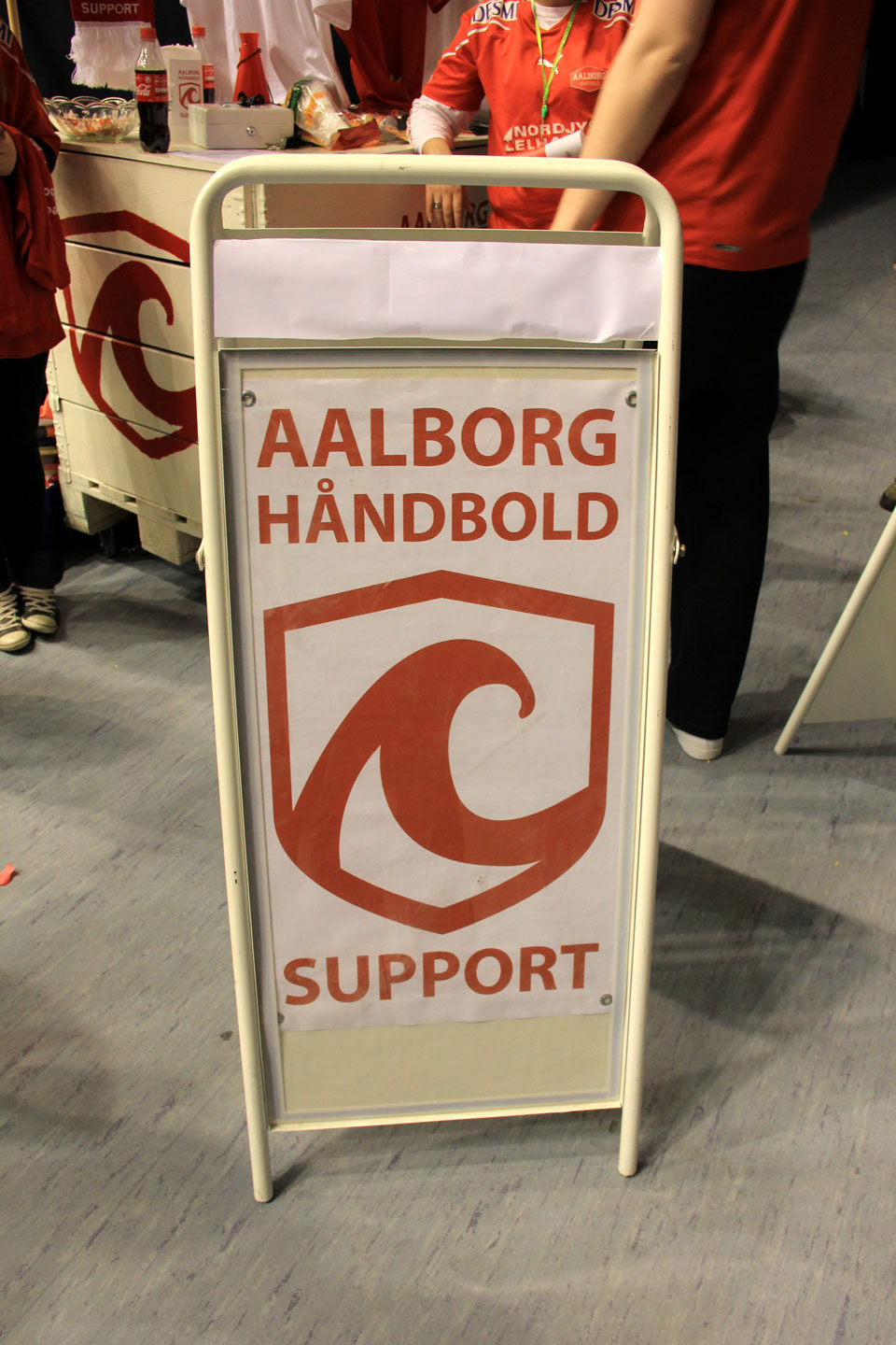
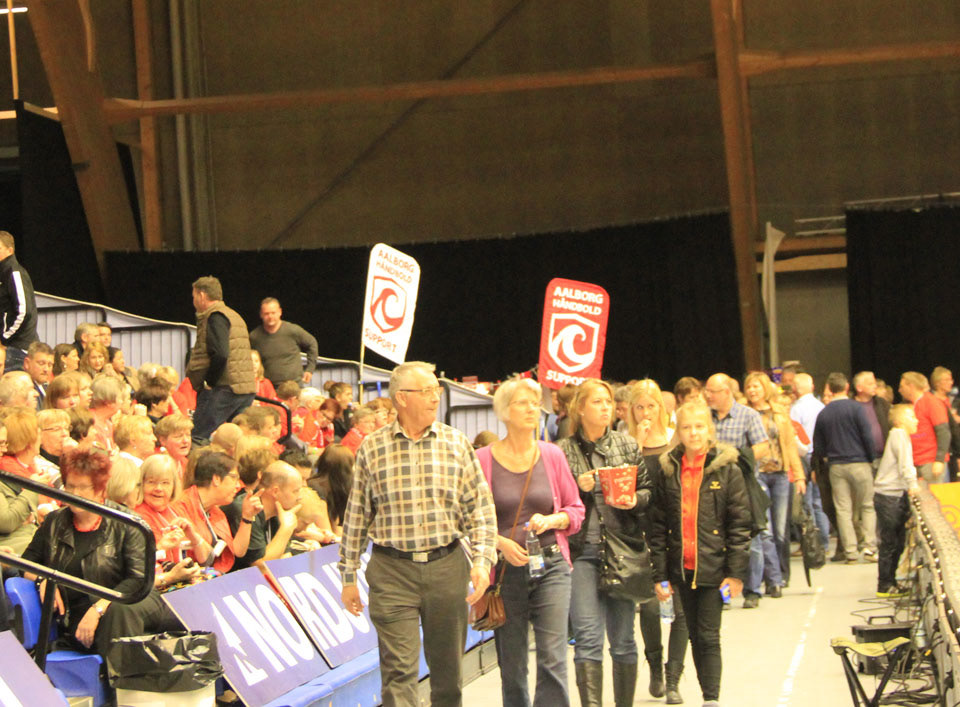
Identity for a handball fanclub
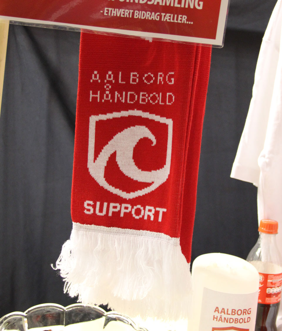
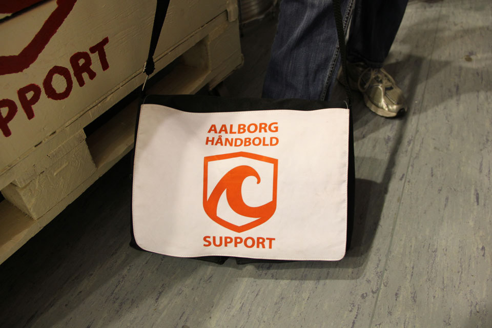
The logo is based on a shield as well as the name-bearing elements. The core values of the logo is masculinity, and linkage relationships with Aalborg.
The shield represents the primary struggle and strength, which are vital components ofsports. Next, the shield also associated with tradition, as it readily associated with acrest, which in turn support the concept of struggle and strength.
To locate the logo has been based in Aalborg's geographic mark - Limfjorden. Limfjorden has been visualized in the form of a prominent wave, which also signals the momentum and force.
The logo has a heavy contour so that the whole appears with a masculine signal value, and raises awareness.
The name "Aalborg Handball" is exalted above the shield, while the "Support" located under the shield. In this way shows "Support" as a foundation or support for the club. This is a simple but powerful image of our role in Aalborg Handball.